How to Use Your Call Analytics Dashboard Like a Pro
Your call analytics dashboard is probably the most underused tool in your tech stack.
That's a bold statement. But after talking to dozens of sales and support teams, I've noticed the same pattern: companies invest in powerful analytics tools, run them for a few weeks, then quietly ignore them because nobody knows what to actually do with all that data.
Stan runs sales ops at a mid-sized software company. He spent three weeks building a beautiful call analytics dashboard. Custom widgets, color-coded metrics, the works. Leadership loved it. But then they started asking questions he couldn't answer. "Why are calls dropping off on Tuesdays?" "What's causing the spike in handle time?" The dashboard showed what was happening, but Stan couldn't explain why.
Sound familiar?
Here's the thing: a call analytics dashboard isn't just a reporting tool. It's a decision-making engine. When you know how to read it properly, every chart tells a story about your team, your customers, and your opportunities for improvement.
What Makes a Call Analytics Dashboard Actually Useful
Let's start with a hard truth. Most dashboards show too much data. You end up staring at 47 different metrics without knowing which ones deserve your attention.
The best call analytics dashboard setups focus on three things:
Actionable metrics. Numbers you can actually change through coaching, process adjustments, or resource allocation. Average handle time? Actionable. Total calls made since 2019? Not so much.
Trend visibility. Single data points are nearly useless. You need to see patterns over days, weeks, and months. Is that 12% abandonment rate getting better or worse?
Role-specific views. Your support agents don't need the same dashboard as your VP of Sales. Different roles need different information to make smart decisions.
The Metrics That Actually Matter
Every team is different, but certain call analytics metrics consistently prove valuable across industries. Here are the ones worth monitoring daily.
Call Volume and Timing
This seems basic, but you'd be surprised how many teams don't track it properly. Knowing when calls peak helps with staffing. Knowing when they drop reveals potential problems.
Watch for:
- Daily and weekly patterns (most B2B teams see Tuesday-Thursday spikes)
- Seasonal trends that affect capacity planning
- Sudden volume changes that might signal marketing campaigns or product issues
Pro tip: overlay your call volume against marketing activities. That spike last month? Probably the webinar follow-ups.
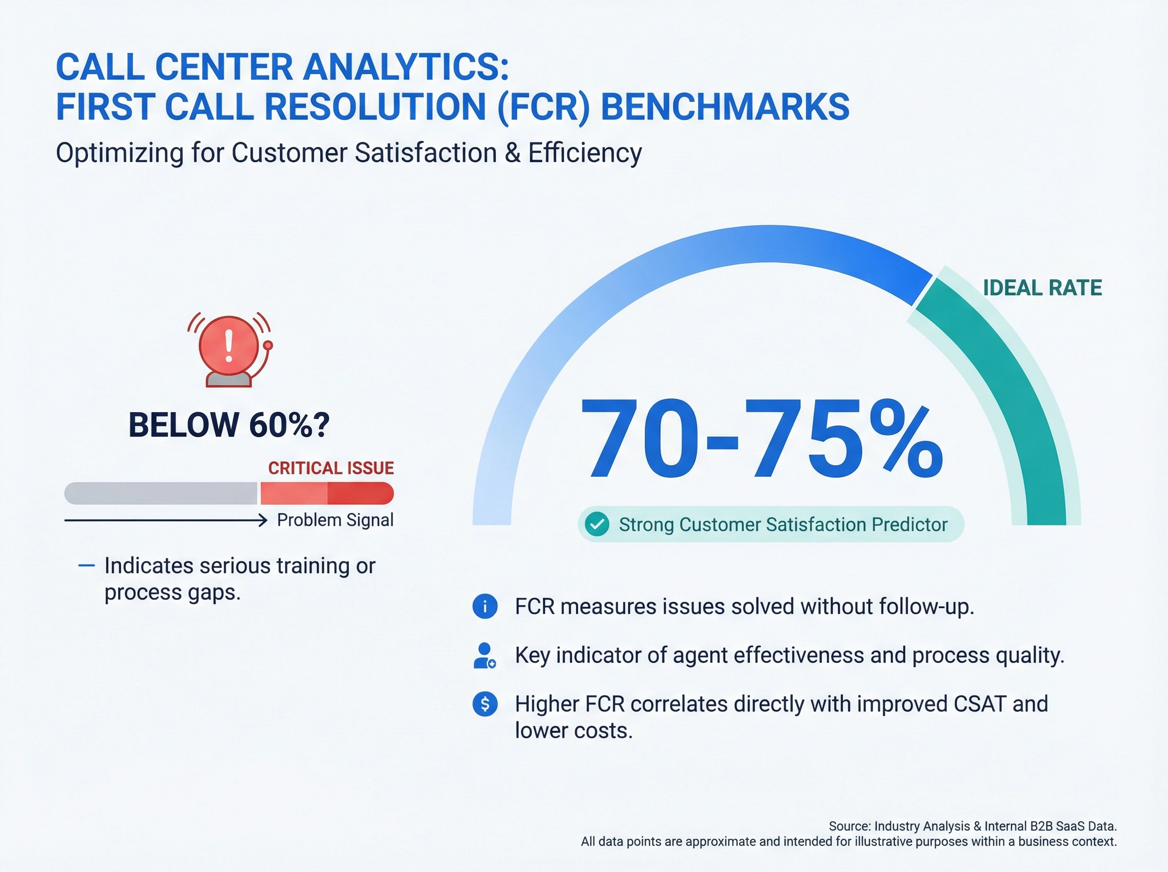
First Call Resolution Rate
First call resolution (FCR) measures how often customers get their issues solved without calling back. It's one of the strongest predictors of customer satisfaction, and it's where many teams struggle.
A good FCR rate sits between 70-75%. Below 60%? You've got a training or process problem that's costing you money in repeat calls.
Here's where your call analytics dashboard gets useful: segment FCR by issue type, agent, and time of day. You'll quickly spot patterns. Maybe warranty questions get resolved 90% of the time, but billing disputes only hit 45%. That tells you exactly where to focus improvement efforts.
Average Handle Time
Average handle time (AHT) is tricky. Lower isn't always better.
Yes, shorter calls mean more capacity. But rushing customers creates callbacks, complaints, and churn. The goal is appropriate handle time: fast enough to be efficient, slow enough to actually solve problems.
Compare AHT across your team. If Amy handles similar calls in 4 minutes while Bob takes 8, there's a coaching opportunity. Maybe Amy uses better call scripts. Maybe she knows the product cold. Maybe Bob is actually doing something valuable that Amy skips. Your dashboard shows the gap. You need to investigate the cause.
Call Abandonment Rate
When customers hang up before reaching an agent, that's an abandoned call. Every abandoned call is a missed opportunity (or worse, a frustrated customer heading to your competitor).
Healthy abandonment rates stay under 5%. Anything above 8% signals a serious problem with wait times or call routing.
Your call analytics dashboard should track abandonment by time of day. Spikes during lunch hours? You need better shift coverage. Spikes after 5pm? Consider extending hours or adding after-hours options.

Reading Your Dashboard for Problems (Before They Blow Up)
The real power of call analytics isn't in pretty reports. It's in early warning systems.
The Tuesday Mystery
Remember Stan's question about Tuesday call drops? Here's how to actually solve it: compare your Tuesday metrics against the weekly baseline, then drill down.
Check call attempts versus connects. If attempts are normal but connects drop, you might have a technical issue: bad phone numbers, routing problems, or system glitches.
Check agent availability during Tuesday peaks. Overlapping meetings? Training sessions? Sometimes the answer is embarrassingly simple.
Check if Tuesday prospects are somehow different. Maybe that's when your marketing team's email campaigns hit, and those leads have different behaviors. (Understanding when to call vs email can help explain why.)
Most "mysterious" patterns have mundane explanations. The dashboard points you toward the right questions.
Spotting Training Gaps
Agent-level comparison is where dashboards really shine for team development. Look for outliers (both high and low performers) and investigate what drives the difference.
When you see one rep consistently crushing it on certain call types while others struggle, that's a coaching opportunity. Record those calls. Figure out what works. Share it with the team.
The same goes for quality scores if you're tracking them. Wide variation between agents usually means inconsistent training, not talent differences.
Finding Process Bottlenecks
Long handle times on specific call types often indicate process problems, not people problems.
If every agent takes 15 minutes on refund requests while everything else averages 6 minutes, your refund process probably needs fixing. Maybe it requires too many approvals. Maybe the system doesn't give agents the right information upfront.
Use your call analytics dashboard to identify these patterns, then dig into the root cause.
Setting Up Useful Alerts
Raw data is only valuable if you see it in time. Configure your dashboard to notify you when metrics hit warning thresholds.
Essential alerts to set up:
- Abandonment rate exceeds 8% for more than 30 minutes
- Wait times spike above your SLA threshold
- Call volume drops more than 20% below expected (might indicate system issues)
- FCR falls below 65% over a rolling 24-hour period
But here's the key: don't over-alert. If you set up 50 alerts that fire constantly, you'll start ignoring all of them. Stick to truly actionable thresholds that require immediate attention.
Connecting Call Data to Business Outcomes
Your call analytics dashboard becomes really powerful when you connect it to revenue and customer outcomes.
Link Calls to CRM Data
If your phone system integrates with your CRM, you can track which call behaviors lead to closed deals, retained customers, or increased lifetime value.
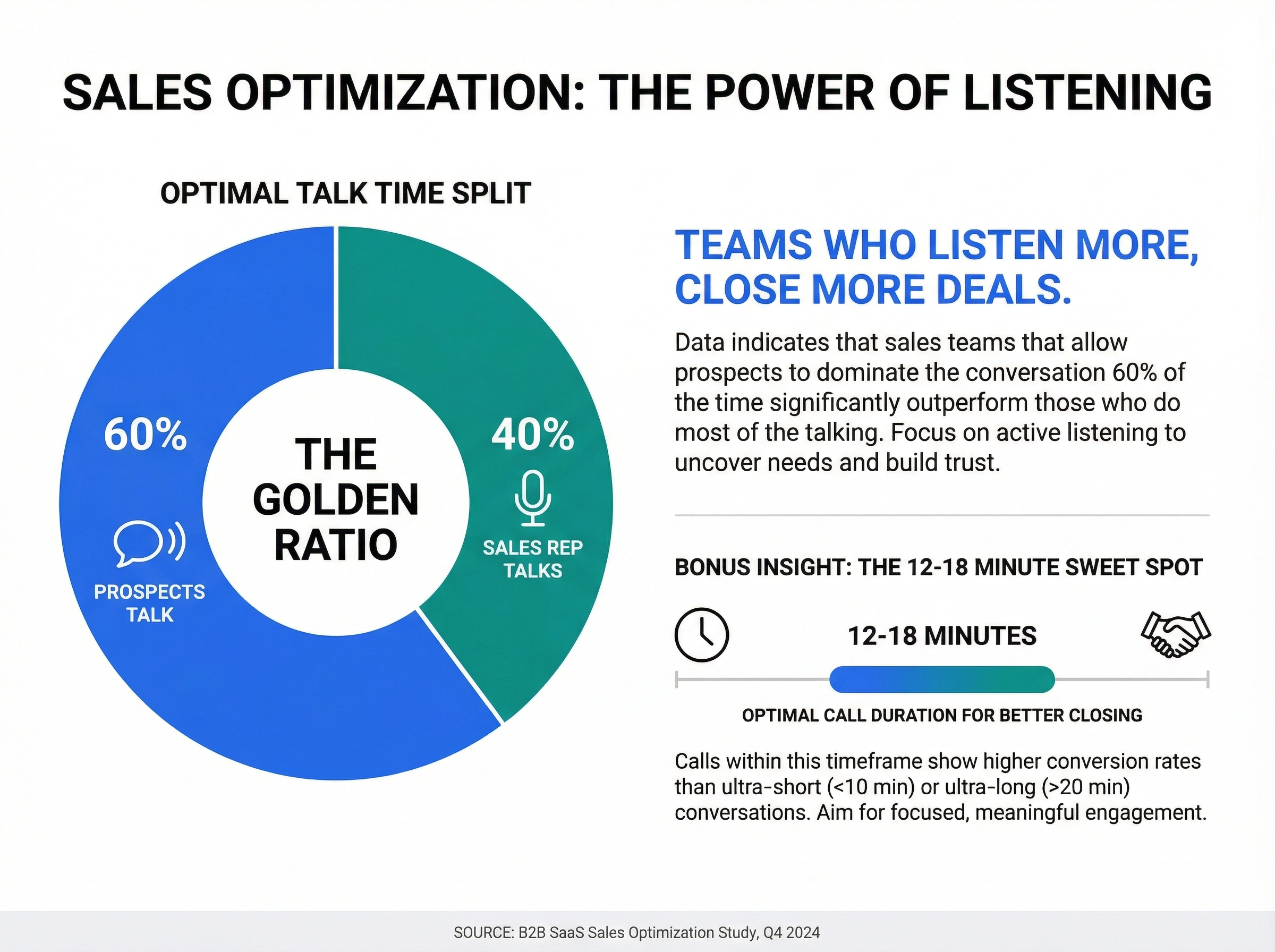
Which call duration correlates with best close rates? Some teams find sweet spots. Calls that run 12-18 minutes close better than ultra-short or ultra-long conversations.
Which talk-to-listen ratio performs best? Sales teams that let prospects talk 60% of the time often outperform teams that do most of the talking.
Calculate Real Costs
Every second of call time has a cost. Every abandoned call has a cost. Every repeat call has a cost.
Use your dashboard metrics to calculate these:
- Cost per call (agent time + system costs + overhead)
- Cost of abandonment (lost sales opportunity or cost of callbacks)
- Cost of poor FCR (repeat calls multiplied by cost per call)
Once you know the numbers, optimizing your call routing becomes an ROI conversation, not a gut-feel decision.
How dialnote Makes Dashboard Insights Actionable
Most call analytics dashboards show you data. dialnote goes further by automatically capturing the context behind the numbers.
When you review a concerning metric (say, low FCR on product questions), you don't have to guess why. dialnote's AI-powered call summaries let you quickly review what actually happened on those calls without listening to hours of recordings.
See a handle time spike? Jump straight to the AI-generated summaries to spot common issues. Notice one rep struggling while others succeed? Review their call transcripts side-by-side to identify coaching opportunities.
The dashboard shows you what to investigate. The AI summaries show you why it's happening and how to fix it.
Getting Started: Your First 30 Days
Don't try to monitor everything at once. Here's a practical approach to actually using your call analytics dashboard.
Week 1: Focus on one metric: your biggest pain point. High abandonment? Low FCR? Pick one and understand it deeply.
Week 2: Set up a weekly review cadence. 15 minutes every Monday to check last week's trends against your baseline.
Week 3: Create two or three alerts for critical thresholds. Test them. Make sure you actually get notified.
Week 4: Share insights with your team. Data hidden in a dashboard helps nobody. Create a simple weekly summary that highlights one trend and one action item.
After that first month, you'll have a rhythm. Add more metrics gradually. But honestly? Most teams get 80% of their value from monitoring 4-5 key numbers consistently.
The Takeaway
Your call analytics dashboard isn't a trophy to show leadership. It's a tool for making better decisions: about staffing, training, processes, and customer experience.
Stop staring at numbers and start asking questions. Why did that metric change? What can we do differently? How do we measure if it worked?
That's how you turn a pretty dashboard into actual business results.
Ready to see what your calls are really telling you? Try dialnote free and get AI-powered analytics that turn raw data into clear next steps.

Written by
Lancelot Dsouza
Chief Marketing Officer, SmartReach.io
Lancelot Dsouza is the Chief Marketing Officer at SmartReach.io, where he built the Marketing, Sales, and Customer Success verticals from the ground up. With over 25 years of experience spanning digital marketing, business development, and strategic...
Lancelot Dsouza is the Chief Marketing Officer at SmartReach.io, where he built the Marketing, Sales, and Customer Success verticals from the ground up. With over 25 years of experience spanning digital marketing, business development, and strategic...
Related Articles

Phone vs Email in Sales: When to Pick Up the Phone
Learn when to call vs email prospects in sales. Get data-backed tips to choose the right channel, handle objections faster, and close more deals.

How to Handle Angry Callers: A Script That Works
Learn how to handle angry callers with proven de-escalation scripts. Get word-for-word phrases that calm frustrated customers and turn complaints into loyalty.

Getting Started with VoIP for Your Business
Learn how Voice over Internet Protocol (VoIP) can transform your business communication with cost savings, flexibility, and advanced features.